Buying committee;
Gretchen
Blair
Kathryn
Purchased end of 2015
Tuesday, March 1, 2016
Motus 6 - Jeena Shin
The paperfold is a dynamic artefact, unstable and
evolving.’
Jeena Shin’s paintings critically examine the spatial properties that inhere in a reticulated network of fold lines. They also probe the visual and spatial resonances produced by varying the intensities of a single colour. Her works acknowledge that colour is deceptive, relative, and duplicitous. The artist is keenly aware of what Josef Albers has already noted, ‘with colour we do not see what we see. Because colour, as the most relative medium in art has innumerable faces or appearances’.2
Whilst meticulously crafted by hand, the subject matter of Shin’s paintings exemplify the propensity for ‘Shiftiness’ found within the digital design realm. Her collections of planes overlay one another, so that interior and exterior spaces are seamlessly enfolded. Her works also reveal multiple viewpoints concurrently.
Dependent upon the location of the viewer and the changing intensity of natural light, Shin’s work reveals or conceals particular qualities of the paintings.3 From a substantial distance, the works resemble monolithic monochromes. However, viewed at a middle distance, the reticulated network of folded planes and the surfaces formed between them are disclosed. Close up, one can admire the taut, polished finish of the painted surfaces and the thick, immaculately rendered crease lines formed by the accumulated layers of pigment.
Shin’s works probe the interstitial spaces found within folded surfaces. Contingent upon viewer position, their undulating, serpentine forms are revealed or concealed from view. Through her strategic deployment of the oblique, Shin generates painterly spaces of rich complexity.
Buying committee:
Blair
Gretchen
Kathryn
Purchased 2016
Jeena Shin’s paintings critically examine the spatial properties that inhere in a reticulated network of fold lines. They also probe the visual and spatial resonances produced by varying the intensities of a single colour. Her works acknowledge that colour is deceptive, relative, and duplicitous. The artist is keenly aware of what Josef Albers has already noted, ‘with colour we do not see what we see. Because colour, as the most relative medium in art has innumerable faces or appearances’.2
Whilst meticulously crafted by hand, the subject matter of Shin’s paintings exemplify the propensity for ‘Shiftiness’ found within the digital design realm. Her collections of planes overlay one another, so that interior and exterior spaces are seamlessly enfolded. Her works also reveal multiple viewpoints concurrently.
Dependent upon the location of the viewer and the changing intensity of natural light, Shin’s work reveals or conceals particular qualities of the paintings.3 From a substantial distance, the works resemble monolithic monochromes. However, viewed at a middle distance, the reticulated network of folded planes and the surfaces formed between them are disclosed. Close up, one can admire the taut, polished finish of the painted surfaces and the thick, immaculately rendered crease lines formed by the accumulated layers of pigment.
Shin’s works probe the interstitial spaces found within folded surfaces. Contingent upon viewer position, their undulating, serpentine forms are revealed or concealed from view. Through her strategic deployment of the oblique, Shin generates painterly spaces of rich complexity.
Buying committee:
Blair
Gretchen
Kathryn
Purchased 2016
Moonlight Night - Gretchen Albrecht
Gretchen Albrecht graduated from Elam School of Fine Arts with Honours in 1963 and quickly established herself as a leading artist in New Zealand: her first solo exhibition in 1964 was opened by Colin McCahon. Albrecht has created new work and exhibited extensively in New Zealand and internationally for five decades, continuing her investigation into the endless possibilities of abstraction: a testament to her sustained artistic and spiritual explorations.
Albrecht’s paintings combine formal and physical qualities - a sensuous colour palette counterpoints rhythmic patterns of proportion, scale, shape, line and texture. The tactile quality of the work with its assured swirling brushstrokes resonate with allusions to an inward sense of order and the underlying rhythms of nature, creating work that revels in the joy of painting.
Since the 1970s, Albrecht's work has evolved from the poured acrylic 'stained canvases' for which she first gained widespread recognition, into a pair of signature 'shaped-canvas' formats: the hemisphere (half circle) and the oval. These are shapes that Albrecht associates with particular meanings and states of mind. In the shaped canvas paintings she has been producing since the early 1980s, resonant combinations of colour and geometry create images with a clear poetic impulse, in which references to architecture, art history, landscape, family and the cosmos act as emotional points of departure.
Albrecht's artistic horizons have broadened in recent years, to encompass large-scale stainless steel sculpture and the inception of a series of multi-paneled rectangular
paintings featuring an inner rectangular ‘threshold' motif. In 2009 Albrecht began working on a new series of rectangular paintings featuring oval-shaped vortices of colour combined with slender horizontal geometric figures. Albrecht continues to
develop her ideas using the hemisphere, oval and the newly added rectangle.
Buying Committee :
Blair
Gretchen
Kathryn
Purchase February 2016
Sunday, March 29, 2015
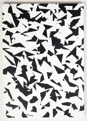
Noel Ivanoff - Slider - Black 4. 2014
The medium is oil on
aluminium panel. It measures 1200 mm x 800 mm
Buying Committee
Blair
Kate
Bryce
Purchased March 2015
Buying Committee
Blair
Kate
Bryce
Purchased March 2015
Tuesday, October 7, 2014
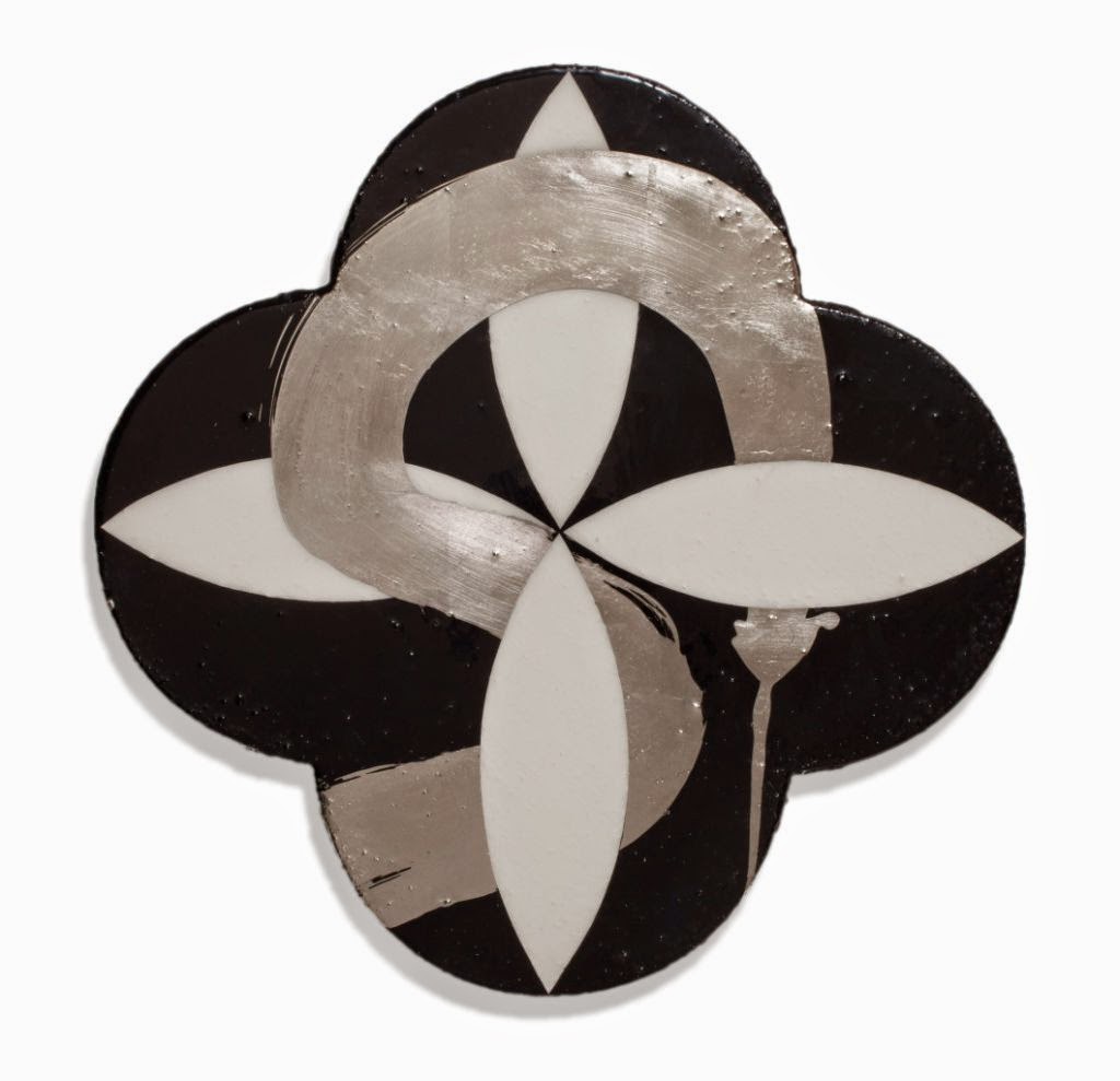
Divine Grace - Max Gimblett
Based in New York for the
past 40 years, Max Gimblett has established himself as New Zealand’s premier
expat expressionist. He has earned this reputation by diligently exploring the
possibilities of a streamlined formal vocabulary in which Eastern mysticism and
Western abstraction intersect. Gimblett's career spans over
forty-five years and he is increasingly recognised as a key artist in the Asia
Pacific region. This was demonstrated by his inclusion in The Third Mind 2009
Guggenheim show, which traced how artists working in the west have adapted and
transformed eastern ideas and artistic forms into their practices.
gesso, acrylic & vinyl polymers, epoxy, oil size, caplain leaf
on canvas
15" quatrefoil (381mm diameter)Buying Committee;
Gretchen
Blair
Bryce
Purchased April 2014
Sunday, May 12, 2013
Suspended VII (Lightbox) - Cathy Carter
Cathy Carter graduated
with a Bachelor of Visual Arts (Distinction) in 2010 before going on to
complete a Postgraduate Diploma (with Distinction) in 2011. She is currently at
AUT University completing a Master of Arts in Visual Arts. She has been working
and exhibiting as an artist for the past 8 years.
Carter's work seeks to redefine the subjext by reorientating the perspective from which that the subject is viewed. Situations, places and objects that are typically understood from a single, defining point-of-view are upended, re-presented and imbued with a recontexualised narrative that demands deeper explanation. In many ways, Carter's work is charged with breaking down the notion of ideals supplanting commonly held persceptions with new thought.
Carter has exhibited
in successful solo and group shows in Auckland & Sydney and continues to
produce work from her Grey Lynn studio.
Buying Committee;
Glen
Kate
Bryce
Purchased April 2013
Sunday, June 17, 2012
"F" - Andre Sampson
Artist Statement
My practice investigates the roll of contemporary painting and printmaking from the point of view that it is a radical act to gain the viewers attention, and hold it for as long as possible in an image-saturated culture. I am interested in fracturing the viewing experience by collapsing visual patterns and rhythms that arise in the work during its construction. When things aren’t conforming to instinctive visual assumption, when it just doesn’t feel right, then you are compelled to engage with the work.
By bringing together the languages of visual communication from the fields of art history, illustration and contemporary advertising media, I aim to arrive at a place within each work where it becomes its own distinct fact.
Stylistic inconsistencies are deliberately engaged in order to provide an opportunity for intense examination of the tensions that arise where varying modes of communication meet, thus extending the duration of initial impression. Development of affecting tensions arise through the interplay between spontaneity and calculated development, loose gestures and rigid form, fore-ground and back-ground, an interplay between positive and negative space, planes of colour and tone jostle for attention, of stillness and speed, and of noise and silence.
By undertaking an emergent approach to make the work, manipulating the painted and printed surface until the materials do something I have not seen before, the finished work will represent an unanticipated outcome. Works are developed separately, following an individual visual logic.
The use of printmaking processes engages ideas of reproduction, repetition, procedure, and the constructed image. It also allows the pace of the project to slow, without losing any of the spontaneous, gestural and vigorous. Printmaking also instills preparedness for ‘failure’ at every step, an attitude I adapt to my painting practice, because it enables bolder risk taking and increases the opportunity for the occurrence of unforeseen outcomes.
Buying Committee;
Gretchen
Katy
Bryce
Purchased June 2012
My practice investigates the roll of contemporary painting and printmaking from the point of view that it is a radical act to gain the viewers attention, and hold it for as long as possible in an image-saturated culture. I am interested in fracturing the viewing experience by collapsing visual patterns and rhythms that arise in the work during its construction. When things aren’t conforming to instinctive visual assumption, when it just doesn’t feel right, then you are compelled to engage with the work.
By bringing together the languages of visual communication from the fields of art history, illustration and contemporary advertising media, I aim to arrive at a place within each work where it becomes its own distinct fact.
Stylistic inconsistencies are deliberately engaged in order to provide an opportunity for intense examination of the tensions that arise where varying modes of communication meet, thus extending the duration of initial impression. Development of affecting tensions arise through the interplay between spontaneity and calculated development, loose gestures and rigid form, fore-ground and back-ground, an interplay between positive and negative space, planes of colour and tone jostle for attention, of stillness and speed, and of noise and silence.
By undertaking an emergent approach to make the work, manipulating the painted and printed surface until the materials do something I have not seen before, the finished work will represent an unanticipated outcome. Works are developed separately, following an individual visual logic.
The use of printmaking processes engages ideas of reproduction, repetition, procedure, and the constructed image. It also allows the pace of the project to slow, without losing any of the spontaneous, gestural and vigorous. Printmaking also instills preparedness for ‘failure’ at every step, an attitude I adapt to my painting practice, because it enables bolder risk taking and increases the opportunity for the occurrence of unforeseen outcomes.
Buying Committee;
Gretchen
Katy
Bryce
Purchased June 2012
Home Again - Brendan McGorry
“Home Again Again” comes from a series of work exploring personal genealogy and ideas around multiple generations working together and sharing knowledge towards a common goal. In this case the common vision of returning home together, depicted in the cell like cluster of homes they are staring towards.
As is the case in many of McGorry’s paintings compositional elements arise from his studies of Renaissance art in Italy. “Home Again Again” borrows from the seven-metre wide fresco “The Resurrection of the Flesh” (1499-1502) by Luca Signorelli (1441-1523) in the Chapel of San Brizio, Cathedral of Orvieto (S. Maria Assunta), Umbria. It was here that the artist drew every morning while studying renaissance frescos with the New York Studio School in Italy.
Rather than slavishly copying any one, two or three figures from Signorelli, McGorry has borrowed the general disposition and attitudes of the figures: climbing out of one state (death) and into another (resurrection); and their upward gaze. He has therefore linked the resurrection moment (“and the dead shall be raised”) with a contemporary experience of “coming home” to ones roots or origins; a return that happens over and over again, from generation to generation to generation.
The work loosely suggests that the figures are rising from some indeterminate protoplasmic ooze, signified by the pink colour and the cytoplasm below the central figure’s right foot. In McGorry’s painting the figures do not gaze Heavenward; although they do gaze skywards, looking at a cluster of homes. But these houses are visceral and earthly. Mirroring the life and death allegory of Signorelli McGorry’s blue orb signals each man’s genetic beginnings (their heredity) and embodied end (their progeny) in its cluster of houses rendered like the early moments of cell-division in the womb.
Thus “Home Again Again” spans five centuries of art history and the several generations of McGorry’s own family.
Buying Committee;
Gretchen
Katy
Bryce
Purchased June 2012
As is the case in many of McGorry’s paintings compositional elements arise from his studies of Renaissance art in Italy. “Home Again Again” borrows from the seven-metre wide fresco “The Resurrection of the Flesh” (1499-1502) by Luca Signorelli (1441-1523) in the Chapel of San Brizio, Cathedral of Orvieto (S. Maria Assunta), Umbria. It was here that the artist drew every morning while studying renaissance frescos with the New York Studio School in Italy.
Rather than slavishly copying any one, two or three figures from Signorelli, McGorry has borrowed the general disposition and attitudes of the figures: climbing out of one state (death) and into another (resurrection); and their upward gaze. He has therefore linked the resurrection moment (“and the dead shall be raised”) with a contemporary experience of “coming home” to ones roots or origins; a return that happens over and over again, from generation to generation to generation.
The work loosely suggests that the figures are rising from some indeterminate protoplasmic ooze, signified by the pink colour and the cytoplasm below the central figure’s right foot. In McGorry’s painting the figures do not gaze Heavenward; although they do gaze skywards, looking at a cluster of homes. But these houses are visceral and earthly. Mirroring the life and death allegory of Signorelli McGorry’s blue orb signals each man’s genetic beginnings (their heredity) and embodied end (their progeny) in its cluster of houses rendered like the early moments of cell-division in the womb.
Thus “Home Again Again” spans five centuries of art history and the several generations of McGorry’s own family.
Buying Committee;
Gretchen
Katy
Bryce
Purchased June 2012
“Pohutukawa” and “Cabbage Tree” - Brendan McGorry
“Pohutukawa” and “Cabbage Tree” are from McGorry’s 2008 series "Walking home through the forest" in which the artist explored mortality, new life and genealogy.
Buying Committee;
Gretchen
Katy
Bryce
Purchased June 2012
![]() |
| Pohutukawa |
The series was composed as an installation of 10 small portrait paintings arranged in front of a 3 x 4 metre charcoal drawing. The drawing depicted lighthouses as symbols of a light that leads the way, with unravelling legs that spiral down through the drawing, becoming flowering strands of DNA, leading to objects of daily life arranged along the bottom. In amongst the DNA strands and the lighthouses float images of cells dividing and a growing blastocyst which depict the beginnings of new life. The small paintings each depict a different male member of the artist’s family, from his grandfather to his children and nephews; and each figure is accompanied by flowering native tree, after which the painting is named. Taken as a whole, the work illustrates the enduring journey of one genetic print.
Buying Committee;
Gretchen
Katy
Bryce
Purchased June 2012
![]() |
| Cabbage Tree |
Sunday, May 6, 2012
Datura 17.48 - Emma Bass
SPEED
EMPATHY
PERFECTION
PASSION
Award-winning photographer Emma Bass applies her talents
to a diverse range of subject matter.
Emma’s world is visual … light and colour are her lifeblood.
http://www.emmabass.co.nz/about/
Buying Committee - Gretchen, Kathryn, Bryce
Purchased May 2012
EMPATHY
PERFECTION
PASSION
Award-winning photographer Emma Bass applies her talents
to a diverse range of subject matter.
Emma’s world is visual … light and colour are her lifeblood.
http://www.emmabass.co.nz/about/
Buying Committee - Gretchen, Kathryn, Bryce
Purchased May 2012
Monday, February 27, 2012
Graham Hitchcock

Artist statement
I have a drive that needs to be satisfied daily through the creation of artwork be it a painting or sculpture. Because of this, I often have a number of paintings on the go along with sculptures in wax or clay readying for bronze or cast glass pieces. It is not until I arrive at my studio do I know I will feel the urge to do. My works, do not always relate yet they all have an subtle connections, the distorted bodies, unnatural angled hairless heads, large hands is because they are creations from my subconscious and that is how they wish to be exposed. My paintings are often challenging my ideals pushing me to understand, experience situations I would not normally find myself. As I work on a painting or sculpture it becomes a story, which unfolds before me, every little detail becomes an important part of that story. The finished painting has more often than not, been painted over another painting that did not work out however it is now an important background research piece of the final piece. I hope that my art will make the observer smile, laugh or question.
Buying Committee;
Buying Committee;
Gretchen, Katy, Blair
Purchased in Feb 2012
Monday, November 28, 2011
Rene 2 - Elliot Collins

"I first saw Elliot Collins' work in 2007 at his AUT (Auckland) Masters Graduation. His installation filled the largest gallery; a visual brainstorm of gorgeously coloured painting, delicate sculpture, and text-based work almost entirely covering the walls, floor and ceiling of the space. It was a risky approach, and in less capable hands would have seemed chaotic, but the show was impressive both for the quality of the individual works and the assured way with which disparate pieces had been curated by the artist into a cohesive whole.
Elliot Collins' unique method of 'cutting' text into thickly painted surfaces makes the material feel luscious, rich and tactile. It is the poetry of his language, however, that sets him apart from others of his generation. In a critique of Collins' 14m wall installation, recently commissioned by City Gallery Wellington, Mark Amery writes: "Collins' text lives in the cryptic spaces between personal anecdote, literary flourish, art historical quotation and public address ... [while] ... underneath the text swatches of paint swarm up as a school of fish, like a letting-go of modernism and all that is behind us, sent off into the ether by the force of the spinning of the globe". (i)
Here I give thanks for giving everything up and losing nothing. At least that's how I'd like it to go.
This painting has decided to live vicariously through others from now on.
This painting is attempting to speak to us in its peculiar dislocated language of the important themes of our lives.
A love story; nothing else will do.
Here I give thanks to a candle in a dark room.
In artworks like these the viewer has a sense of the artist making himself vulnerable. The paintings are brave, beautifully considered and thought-provoking, with a quality of romantic melancholy and knowing innocence that hits the heart with a flash of recognition. In a world preoccupied with irony and cynicism Collins' paintings are loaded with hope and humanity and possibility. They're probably unfashionable - but that doesn't seem to be doing his career any harm at all."
TIM MELVILLE
August 2010
(i) http://eyecontactsite.com/2010/06/wellington-survey
Elliot Collins' unique method of 'cutting' text into thickly painted surfaces makes the material feel luscious, rich and tactile. It is the poetry of his language, however, that sets him apart from others of his generation. In a critique of Collins' 14m wall installation, recently commissioned by City Gallery Wellington, Mark Amery writes: "Collins' text lives in the cryptic spaces between personal anecdote, literary flourish, art historical quotation and public address ... [while] ... underneath the text swatches of paint swarm up as a school of fish, like a letting-go of modernism and all that is behind us, sent off into the ether by the force of the spinning of the globe". (i)
Here I give thanks for giving everything up and losing nothing. At least that's how I'd like it to go.
This painting has decided to live vicariously through others from now on.
This painting is attempting to speak to us in its peculiar dislocated language of the important themes of our lives.
A love story; nothing else will do.
Here I give thanks to a candle in a dark room.
In artworks like these the viewer has a sense of the artist making himself vulnerable. The paintings are brave, beautifully considered and thought-provoking, with a quality of romantic melancholy and knowing innocence that hits the heart with a flash of recognition. In a world preoccupied with irony and cynicism Collins' paintings are loaded with hope and humanity and possibility. They're probably unfashionable - but that doesn't seem to be doing his career any harm at all."
TIM MELVILLE
August 2010
(i) http://eyecontactsite.com/2010/06/wellington-survey
Purchased September 2011
Buying committee
Blair, Claire, Katy
Sunday, October 2, 2011
Still Life - Roberta Thornley
Although the cinematic quality of her photographs might evoke the dark sensuality of Bill Henson or the surreal narratives of David Lynch, the place to begin with Roberta Thornley's work is in the 'everyday' world. There is no narrative linking her works. Rather, they are discrete images about the simplest and yet most evocative of ideas. Contained within each work is a sense of the efflorescence of life and the wet, dark, decaying extreme that is part of its cycle of disintegration and renewal. Her work has an underlying element of unease, as if each image marks a crucial connection between beauty, desire, and the 'bible-black' of melancholy.
In spite of its being carefully staged, Thornley begins each photographic session with little idea of what will result. The final photographs are an outcome of the process of working with the object or model (often a friend or family member). The physical and emotional fatigue of Rosie was captured only after hours of posing. Drenched with water, she is blank, resigned, and exhausted. It is these moments of letting go - of truthfulness - to which we intuitively respond. They elicit what Roland Barthes calls the photographic 'shock' that is not about 'traumatising' so much as about 'revealing'. (i)
Thornley is a recent graduate of the University of Auckland Elam School of Fine Arts and at the age of 25 she has already generated a consistent body of work. She has a clear sense of what her photographs mean and where she wants to take them, with each series becoming more refined and more simplified. The strength of Thornley's work lies in her having, quite remarkably, and in a very short period of time, claimed her own ground.
Dr Kriselle Baker
published in: Art New Zealand, Issue 134, Winter 2010
Buying Committee;
Blair, Claire, Kathryn
Purchased September 2011
Monday, April 11, 2011
Little Smasher - Miranda Parkes
Little Smasher exemplifies the best of Parkes' practice: her confidence and the refinement of her art technique shines through. The work is resolutely abstract, yet both the form and colour palette are familiar to the viewer from the landscape: greens, yellows and mauves overlay, folded, rolling forms.
Modernist painting and illustrate Parkes' knowledge of Op-Art and Abstraction. By flirting with the decorative aspects of her composition, the artist both subverts and pays homage to those artistic traditions.
Miranda Parkes is a talented young artist who has proven her ability and importantly her tenacity and desire to continue to make art in the years ahead. Parkes has consistently shown in group, as well as solo, shows, in Auckland and her native Christchurch.
Little Smasher survived the latest Christchurch earthquake, where the artist's studio was destroyed. It shares the title of the show at Antoinette Godkin Gallery, which was in fact confirmed before the quake.
Little Smasher possesses a bold visual impact, defying gravity and expectations. It is a serious work that punches above its weight, with a playful nod toward the past, and a serious work with a playful nod toward past traditions and future possibility.
Buying Committee;
Blair, Glen, Kay
Purchased March 2011
Wednesday, March 23, 2011
Rita Borbeletta - Charlotte Sinnema

The link to Charlotte's website;
http://www.charlottesinnema.com/
The link to a Campbell Live clip on Charlotte;
http://www.3news.co.nz/Charlotte-overcomes-the-odds-to-hold-first-art-exhibition/tabid/367/articleID/131676/Default.aspx
Buying Committee;
Blair, Kay, Glen
Purchased November 2010
Subscribe to:
Posts (Atom)